Understanding how to use the disabled attribute in HTML effectively, is essential for creating user-friendly web applications that guide users through proper workflows.
HTML attributes are special properties that give additional information about elements and control their behavior.
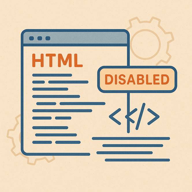
One of the most useful attributes for creating interactive web forms and user interfaces is the disabled attribute, which temporarily prevents users from interacting with buttons, input fields, and other form elements.
What is the disabled Attribute?
The disabled attribute is a boolean HTML attribute that makes form elements non-interactive and unusable.
When applied to an element, it essentially "turns off" that element, preventing users from clicking, typing, or otherwise interacting with it.
This attribute can apply to various form elements, including buttons, input fields, text areas, select dropdowns, and even entire field sets.
People commonly use the disabled attribute on:
- Submit and action buttons
- Text input fields
- Checkboxes and radio buttons
- Select dropdown menus
- Text areas
- Field set elements (to disable entire sections of a form)
When an element has the disabled attribute, browsers typically display it with a grayed-out appearance, visually showing to users that the element is not currently available for interaction.
What Happens When an Element is Disabled?
When you add the disabled attribute to an HTML element, several important changes occur in how that element behaves:
No Click Interaction: Disabling elements prevent clicking or activation. If you try to click a disabled button, nothing happens—no click events fire, and no associated JavaScript functions execute.
Preventing unwanted actions when conditions aren’t met is crucial.
No Form Submission: The system completely excludes disabled form elements from form submissions. Even if a disabled input field contains data, that data won't be sent to the server when the form is submitted.
This behavior helps ensure that your backend systems process only valid, user-entered data.
Skipped in Tab Order: When users navigate through a webpage using the Tab key (an important accessibility feature), the browser automatically skips disabled elements.
This creates a smoother navigation experience for keyboard users and screen reader users, as they won't get stuck on elements they can't interact with.
Visual Styling Changes: Browsers apply default styling to disabled elements, typically making them appear grayed out or faded.
This visual feedback immediately communicates to users that the element is not currently available, improving the overall user experience.
JavaScript Event Blocking: Disabled elements don't trigger most JavaScript events like click, focus, or input events. This prevents accidentally running scripts when elements shouldn't be interactive.
Common Use Cases and Examples
The disabled attribute shines in scenarios where you need to control user interactions based on specific conditions or application states. Here are some practical examples:
Submit Button Disabled Until Form is Valid: One of the most common patterns is disabling a submit button until all required form fields are properly filled out.
For example, imagine a registration form where users must enter their name, email, and password. The submit button remains disabled until all three fields contain valid data, preventing users from accidentally submitting incomplete forms.
An HTML Form with Disabled Attribute Example
Notice how you can't click on the form button, and it looks grayed out. Paste the following code into a code editor like CodePen, inside the HTML section.
Disabled Attribute Form Example
<form> <input type="text" id="name" placeholder="Your Name" required> <input type="email" id="email" placeholder="Your Email" required> <input type="password" id="password" placeholder="Password" required> <button type="submit" id="submitBtn" disabled>Create Account</button> </form>Preventing Double Submissions: Another crucial use case is disabling a button immediately after it's clicked to prevent users from accidentally submitting the same action multiple times.
This is especially important for payment forms, where double-clicking could cause duplicate charges.
Progressive Form Disclosure: You can disable certain form sections until users complete previous sections.
For instance, in a multistep checkout process, the shipping information section could remain disabled until the user has selected their items and quantities.
Loading States: During asynchronous operations like API calls, you can disable relevant buttons to show that the system is processing the request. This prevents users from clicking multiple times while waiting for a response.
Conditional Access: Based on user permissions or account status, certain features might be disabled. For example, the system might disable the “Delete” button for users lacking admin privileges.
Time-Based Restrictions: Some applications disable certain actions during maintenance windows or outside business hours. The disabled attribute provides a clean way to temporarily remove functionality and avoid completely hiding elements.
Best Practices for Using the disabled Attribute
When implementing disabled elements, consider these important practices:
Always provide clear visual feedback beyond the browser's default styling. Use CSS to make disabled states obvious, and consider adding explanatory text or tooltips to help users understand why an element is disabled.
Ensure your disabled elements are accessible to screen readers by using appropriate ARIA labels and descriptions.
Screen reader users should understand not just that an element is disabled, but also why it's disabled and what they need to do to enable it.
Use JavaScript to dynamically enable and disable elements based on form validation and user interactions. This creates responsive, interactive experiences that guide users through proper workflows.
Test your disabled elements thoroughly across different browsers and devices to ensure consistent behavior and appearance.
The Technical Details
From a technical perspective, the disabled attribute is a boolean attribute, meaning its presence alone is what matters, not its value. You can write it as disabled, disabled="", or disabled="disabled"—all three are equivalent.
The attribute works by setting the element's disabled property to true in the DOM, which browsers then used to determine interaction behavior.
You can also control this programmatically with JavaScript using element.disabled = true or element.disabled = false.
Want to learn how to actually disable a button with HTML, CSS, and JavaScript? Click here for the step-by-step tutorial.
Conclusion
The disabled attribute is a powerful tool for creating intuitive, user-friendly web interfaces.
By preventing unwanted interactions, guiding users through proper workflows, and providing clear visual feedback about element states, it helps create professional, polished web applications.
Whether you are building simple contact forms or complex, multistep processes, effectively using the disabled attribute will make your forms more robust and your users more successful.