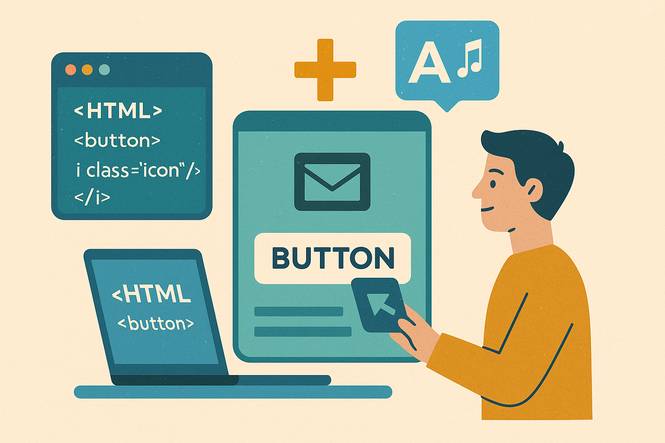
Discover how to easily add font icon libraries into your HTML buttons. This guide walks you through using libraries like Font Awesome to create visually appealing and functional button icons for your website.
Buttons are the backbone of user interaction on websites, guiding visitors to take actions like submitting forms, navigating pages, or adding items to a cart.
When paired with icons, buttons become more than just functional elements—they transform into intuitive, visually appealing components that enhance the overall user experience.
Icons provide a universal language, making it easier for users to understand a button’s purpose at a glance, whether it’s a shopping cart, a download arrow, or a menu toggle.
Among the many tools available, three font icon libraries stand out for their versatility and widespread adoption: Font Awesome, Bootstrap Icons, and Material Icons.
These libraries offer thousands of scalable, customizable icons that integrate seamlessly with HTML buttons.
This guide will walk you through the process of incorporating these libraries into your buttons, step by step, while highlighting best-practices for accessibility, styling, and troubleshooting.
Method 1 How to add (Font Awesome Icons)
Code Example
Font Awesome Icon Button
--HTML--

<!-- Load Font Awesome -->
<link rel="stylesheet" href="https://cdnjs.cloudflare.com/ajax/libs/font-awesome/6.5.0/css/all.min.css">
<button onclick="saveAction()">
  <i class="fa fa-save"></i> Save
</button>

--CSS--

button {
  padding: 10px 20px;
  font-size: 16px;
  cursor: pointer;
}
.fa {
  margin-right: 8px;
}

--JavaScript--

function saveAction() {
  alert('Your Document is Saved!');
}Code Explanation
- Loads fonts via the CDN link
- Inside the link, pay attention to version number
- Icon element Syntax is used in 4.x
To properly test this code, visit a code editing website like JSFiddle Coding Playground. Paste each code seperately to the HTML, CSS, and JavaScript section. The JavaScript and CSS code are both general (nothing special), so we will focus only on the HTML section.
When adding Font Awesome to a website, in this case we have: <link rel="stylesheet" href= "https://cdnjs.cloudflare.com /ajax/libs/font-awesome/6.5.0/css/all.min.css">. Quickly scan the link and notice three elements, cdnjs.cloudflare.com, font-awesome, and 6.5.0.
Cdnjs.cloudflare.com tells us that it's a content delivery network hosted on Cloudflare.com. Font Awesome means the link has access to the font awesome assets. Finally, but most important, the font awesome version number 6.5.0.
When downloading font awesome assets, make sure you get the latest version. The latest version as of today should be 6.7.2. Before downloading, check the link and update the version number.
Once you have linked to the font awesome CDN, create a button like this:
<button onclick="saveAction()">
<i class="fa fa-save"></i> Save
</button>
Pay attention to the icon element from Font Awesome: <i class="fa fa-save"></i>. Note, the syntax you see here: fa fa-save is from version 4.x. In Font Awesome 5+, it's fas fa-save. If you don't use the proper version and syntax, font icons will not work.
Method 2 How to add (Bootstrap Icons)
Code Example
Bootstrap Icon Button
--HTML--

<!-- Load Bootstrap Icons -->
<link rel="stylesheet" href="https://cdn.jsdelivr.net/npm/[email protected]/font/bootstrap-icons.css">
<button onclick="downloadAction()">
  <i class="bi bi-download"></i> Download
</button>

--CSS--

button {
  padding: 10px 20px;
  font-size: 16px;
  cursor: pointer;
}
.bi {
  margin-right: 8px;
}

--JavaScript--

function downloadAction() {
  alert('Your Document is Downloading!');
}Code Explanation
- Loads fonts via the CDN link
- Inside the link, pay attention to version number
- Icon element Syntax is correct
The JavaScript and CSS code is general, we will only focus on HTML. Study the link structure: , this is how you will connect to bootstrap font icons. <link rel="stylesheet" href= "https://cdn.jsdelivr.net/npm/bootstrap-icons @1.11.3/font/bootstrap-icons.css">.
Like the previous coding example, skim the link and look for three things, where it connects: cdn.jsdelivr.net, you have the right icons: bootstrap-icons, and version number: 1.11.3. Now create a button like this using HTML:
<button onclick="downloadAction()">
<i class="bi bi-download"></i> Download
</button>
Once again, verify the icon element syntax is correct: bi bi-download. In this case, the syntax is correct and it can be used with this version: 1.11.3.
Method 3 How to add (Material Icons)
Code Example
Material Icon Button
--HTML--

<!-- Load Material Icons -->
<link href="https://fonts.googleapis.com/icon?family=Material+Icons" rel="stylesheet">
<button onclick="uploadAction()">
  <span class="material-icons">cloud_upload</span> Upload
</button>

--CSS--

button {
  padding: 10px 20px;
  font-size: 16px;
  cursor: pointer;
}
.material-icons {
  vertical-align: middle;
  margin-right: 8px;
}

--JavaScript--

function uploadAction() {
  alert('Your Document has been Uploaded!');
}Code Explanation
- Loads fonts via the CDN link
- Inside the link, pay attention to version number
- No Version Control
- Icon Element Syntax stays Updated
The first step is to look for the website link: <link href="https://fonts.googleapis.com /icon?family=Material+Icons" rel="stylesheet">, and identify two things. The actual website link: fonts.googleapis.com and the right icon assets: Material+Icons.
Unlike the previous coding examples, Google Material Icons don't have a version number because they are always up-to-date. The same is said about the icon element syntax: <span class="material-icons">cloud_upload</span>. The syntax stays updated as well.
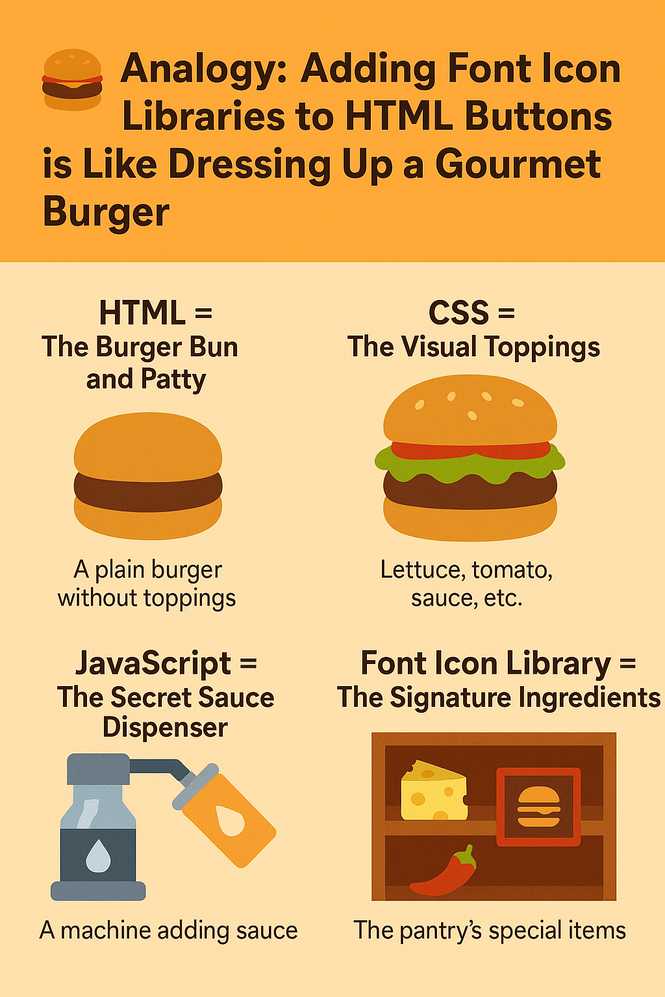
Analogy Infographic
-
HTML - is the base of your burger, just the bun and patty. It’s the structure of your button: plain, but it works.
-
CSS - styles are like choosing how your burger looks, do you want yellow melted cheese, grilled onions, fancy dark green lettuce? You’re dressing up the button and making it look pretty, including setting the size and color of your font icons.
-
JavaScript - is like the smart kitchen tool that adds sauce on demand, you can dynamically load icon libraries like Font Awesome only when needed or control when icons appear based on app requirements.
-
Font Icon Library - (like Font Awesome or Bootstrap Icons) is your treasure chest of special ingredients, premium cheeses, exotic spices, or branded sauces. You include it in your kitchen (HTML) so chefs (the browser) can grab and use them.
Why Add Icons to Buttons?
Icons on buttons serve both aesthetic and functional purposes, elevating the design and usability of a website. They enhance clarity by providing visual cues that reinforce a button’s intent.
For example, a shopping cart icon next to the word “Cart” instantly communicates the action, even to users unfamiliar with the language.
This visual reinforcement improves the user-experience by making navigation more intuitive, especially on mobile devices where screen space is limited.
Icons also align with modern web design trends, where clean, minimalist interfaces dominate. A well-placed icon can reduce the need for lengthy text, creating a sleek and professional look.
Whether it’s a heart icon for favoring content or a phone icon for contacting support, icons make buttons more engaging and memorable, encouraging users to interact with them.
What Are Font Icon Libraries?
Font icon libraries are collections of vector-based symbols designed to function like text characters in a font.
Unlike traditional image icons, which can pixelate when scaled or require multiple file sizes for different displays, font icons are lightweight, scalable, and easily styled with CSS.
Developers can insert icons using simple class names or Unicode characters because webpages embed these as font files.
Font Awesome, Bootstrap Icons, and Material Icons are among the most popular libraries, each with its own strengths.
Font Awesome is known for its vast icon collection and flexibility, offering both free and premium options suitable for any project.
Bootstrap Icons, designed to complement the Bootstrap framework, provide a cohesive set of icons with a minimalist aesthetic, ideal for developers already using Bootstrap’s CSS.
Material Icons, created by Google, follow the Material Design philosophy, offering a clean, modern look that integrates well with Android apps and web projects.
All three libraries are free to use, easy to implement, and support CSS customization, making them perfect for enhancing HTML buttons.
While each library has a unique style and icon set, their core advantage lies in their scalability and performance.
Font icons load faster than image files, don’t require multiple HTTP requests for different screen resolutions, and can be colored, sized, or animated using CSS properties.
This makes them a go-to solution for modern web development.
Accessibility Considerations
While icons enhance visual appeal, developers must implement them thoughtfully to ensure accessibility for all users, including those relying on screen readers or keyboard navigation.
Decorative icons—those that don’t convey essential information—should include the aria-hidden="true" attribute to prevent screen readers from announcing them unnecessarily.
For example, a magnifying glass icon on a search button is decorative if the button also contains the word “Search.”
However, when an icon is the only content within a button, such as a standalone hamburger menu icon, accessibility requires additional measures.
In these cases, use an aria-label or title attribute to describe the button’s function. For instance, a menu button with only a hamburger icon could include aria-label=”Open navigation menu” to ensure screen readers convey its purpose.
Alternatively, pairing icons with text labels, like “Menu” alongside the icon, eliminates ambiguity and benefits all users, including those with cognitive impairments.
Avoid relying solely on icons without text, as this can confuse users who don’t recognize the symbol or whose devices cannot load the icon library.
By combining icons with clear text and proper attributes, you create buttons that are both visually appealing and inclusive.
Styling Tips for Icon Buttons
Styling icon buttons effectively requires attention to spacing, sizing, and visual effects to ensure a polished look. Proper spacing is critical to prevent icons from appearing cramped next to text.
Using CSS properties like padding or margin, you can create breathing room between the icon and the button’s text or edges.
For example, adding a small margin to the right of an icon ensures it doesn’t touch the accompanying text, improving readability.
Icon size should also be proportional to the button’s text. Font icons inherit the parent element’s font size, but you can adjust their size independently using relative units like em or rem.
For instance, setting an icon’s font size to 1.2em makes it slightly larger than the button’s text, creating a balanced visual hierarchy.
Relative units ensure the icon scales appropriately across different screen sizes, maintaining consistency in responsive designs.
To enhance interactivity, consider adding hover effects or color changes to icon buttons. A subtle shift in the icon’s color or a slight scale transformation on hover can make the button feel more dynamic.
For example, changing a cart icon from gray to green when a user hovers over the “Add to Cart” button reinforces the action and draws attention.
You can achieve these effects with CSS pseudo-classes like :hover, ensuring a smooth and engaging user experience. When styling, test your buttons across devices to ensure icons remain crisp and aligned.
Consistent styling not only improves aesthetics but also reinforces brand identity, making your website feel cohesive and professional.
Common Errors and Troubleshooting
Adding font icon libraries to buttons is straightforward, but minor oversights can lead to issues. One common mistake is forgetting to load the icon library properly.
Each library requires a specific link or script tag in the HTML document’s section to fetch its font files. If this link is missing or incorrect, icons won’t display, leaving buttons with blank spaces or placeholder characters.
Double-check the library’s official setup instructions and verify that the link is active and points to the correct version. Another frequent error involves using incorrect class names for icons.
Each library has its own naming convention, and even a single misplaced character in a class name can prevent an icon from rendering.
For example, Font Awesome icon might use a prefix like fa-, while Material Icons rely on specific kebab-case names. Refer to the library’s icon gallery or documentation to ensure you’re using the exact class name for the desired icon.
Misaligned icons are another common issue, often resulting from insufficient padding or mismatched font sizes. If an icon appears off-center within a button, adjust the button’s CSS to include equal padding on all sides.
Similarly, ensure the icon’s font size is compatible with the button’s text size to maintain vertical alignment. Testing in multiple browsers can help catch alignment issues early.
Finally, neglecting accessibility cues, such as omitting aria-hidden for decorative icons or failing to provide text alternatives, can harm usability.
Always test your buttons with tools like screen readers to ensure they’re inclusive. By anticipating these pitfalls, you can streamline the process and create functional, visually appealing icon buttons.
Frequently Asked Questions
How do I use Font Awesome Icons in HTML Buttons?
Font Awesome icons are widely used and can be added to HTML buttons by linking the Font Awesome library and applying the correct icon class names within the button element, ensuring proper styling.
What is the Difference between Font Awesome and Material Icons?
Font Awesome offers a broader icon set with free and premium options, while Material Icons follow Google’s Material Design with a minimalist, free-only collection.
How do I make HTML Buttons with Icons Responsive?
Use relative units like rem or em for icon and button sizes, and apply CSS media queries to adjust padding and margins for different screen sizes.
Can I Customize the Color of Font Icons on Buttons?
Yes, font icons can be customized using CSS properties like color, applied directly to the icon’s class or via hover effects for interactivity.
Does the Font Icon Library Version Matter?
Yes it does! When a new version is out, new updates take place that can change icon element syntax. Always update the syntax to match the newest font icon version.
Related Lessons (Continue Learning)
Using Icon Fonts in HTML Buttons
Who Uses Icon HTML Code and Why?
Where are Font Icons Used in Buttons?
Conclusion
Incorporating font icons into HTML buttons is a powerful way to elevate a website’s design, making interactions more engaging and intuitive.
Font Awesome, Bootstrap Icons, and Material Icons offer versatile, scalable solutions that cater to different design needs, from expansive icon collections to minimalist aesthetics.
By understanding how to implement these libraries, prioritize accessibility, and apply thoughtful styling, you can create buttons that not only look great but also enhance usability for all users.
Experimenting with these three libraries allows you to discover which best suits your project’s style and functionality.
These small touches—icons paired with clear labels, subtle hover effects, and inclusive design practices—make a significant difference in crafting a modern, user-friendly web experience that stands out in a crowded digital landscape.