Emojis can make HTML buttons more engaging and intuitive, but only when used correctly. Discover when it's appropriate to use emojis, their impact, and tips for optimizing user interaction.
Imagine your team rolling out a sleek new company portal. Should you jazz up the login button with a smiley face or thumbs-up? It’s tempting! Emojis can make your website pop, but timing matters.
Knowing when to use emojis keeps your buttons engaging and professional. Let’s dive into the best moments to add that spark and when to keep things buttoned up.
When to Use Emojis Effectively
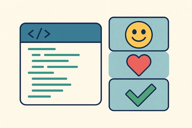
Emojis work wonders in specific cases, making buttons clear and inviting. For action-based buttons like “Save,” “Submit,” or “Confirm,” a checkmark or floppy disk boosts recognition and encourages clicks. You can search for emoji sites like Flaticon.com to find a variation of helpful icons.
In internal tools, a warning sign can flag urgent tasks, like “Review Needed,” grabbing attention fast. Mobile apps and dashboards shine with emojis—a house 🏠 for “Home” or gear for “Settings” simplifies navigation, especially on small screens.
In e-commerce, a shopping cart on a “Buy Now” button drives engagement. Emojis excel when they match the button’s purpose, enhancing user-experience without clutter. For managers, this means creating interfaces that feel modern and approachable, streamlining workflows while keeping users engaged.
Strategic emoji use ensures your team’s tools are both functional and inviting, boosting efficiency and interaction.
When to Avoid Them
Emojis aren’t always the right fit. In legal or sensitive contexts, like HR forms or contracts, a heart or star ⭐ might feel out of place, risking credibility. Formal settings, such as executive dashboards or compliance portals, demand clarity over flair—skip emojis here.
Buttons with vague purposes, like a generic “Click Here” with a random arrow, can confuse users. Overloading interfaces with emojis muddles their impact, creating clutter. Managers should prioritize professionalism while keeping tools user-friendly.
Use emojis only where they add value, ensuring your team’s platforms remain polished and purposeful. This balance keeps your brand sharp and your interfaces effective without sacrificing functionality.
The Balance Between Clarity and Fun
Striking the right balance between clarity and fun is crucial when deciding when to use emojis. Smartly placed, emojis make buttons intuitive and engaging—a checkmark or arrow guides users effortlessly, boosting clicks.
They add a cheerful vibe, making internal tools or customer apps feel welcoming and modern. But overuse or poor placement can confuse users or undermine professionalism.
Choose emojis that align with the button’s intent, like a megaphone 📣 for “Announce” or calendar for “Schedule.” Test them with your team to ensure they resonate. This approach keeps interfaces lively yet clear, aligning with business goals while delighting users.
Managers can leverage emojis to create user-friendly tools that drive results without sacrificing polish. Thoughtful use ensures your brand stays strategic and approachable.
Want to play with emojis? Check out our step-by-step tutorial to get started here: How to Add Emojis in HTML Buttons.
Final Thoughts
Mastering when to use emojis can elevate your team’s portals into engaging, efficient tools. From action buttons to mobile apps, emojis add flair when used wisely.
Managers, empower your team to craft interfaces that blend professionalism and fun. Try a checkmark or house icon, but prioritize clarity. With the right touch, your buttons will stand out, delight users, and boost results.
Dive in today and make your digital tools strategic, cheerful, and unforgettable!