Emojis can improve clarity and engagement when used wisely in HTML buttons. This post explores the best placements and use cases. We also talk about where not to place emojis.
Close your eyes and picture a website. Where are emojis hiding? Are they winking at you from a mobile menu? Smiling from a footer button? Let’s find out where emojis belong—and where they don’t. It’s a button safari, and your mission is to spot the emoji magic!
Where Emojis Enhance the UI
Let’s explore where emojis actually shine in button design. So—where are emojis best used? Think about the buttons you tap most often. Do you pause a second longer when a button has a little sparkle ✨ or a helpful icon? That’s no accident.
In navbars, emojis can guide the eye. An emoji next to “Home” instantly tells the user what to expect. These emojis enhance recognition, especially on mobile layouts where every pixel matters.
Where are emojis also impactful? On cards and call-to-action buttons. An emoji of a rocket next to “Launch Demo” adds excitement. A ❤ emoji beside “Save Favorite” makes it warmer and more inviting.
Then there are mobile menus. Here, users scan quickly, so simple emojis make options stand out with no need for more text. These small touches boost clarity and accessibility—especially for newer users.
Also, shopping carts and checkout buttons are emoji-friendly zones. A shopping cart emoji offers a quick visual context. And let’s not forget the footer: adding a ✉ to contact buttons can wrap up your site with style.
If you are interested in adding emojis to your project, you will find many emoji icons in Emojipedia.org.
So again, where are emojis best used? Wherever you want to add quick emotion, context, or visual recognition without saying too much.
Where They Shouldn’t Go
Now we’ve spotted their best homes. Let’s talk about where emojis don’t belong. First: don’t flood the screen. Where are emojis too much? In cluttered designs. A button bar with five emojis per line? That’s chaos, not creativity.
It turns your UI into a guessing game—and no user wants to play “Emoji Decoder.” Another no-go zone? Confusing icon mixes. If you combine emojis with random icons from different design systems (like Material Icons, Font Awesome, and emojis all at once), the result feels inconsistent.
Where are emojis most awkward? Anywhere they compete with other visuals instead of enhancing them.
Visual Walkthrough Examples
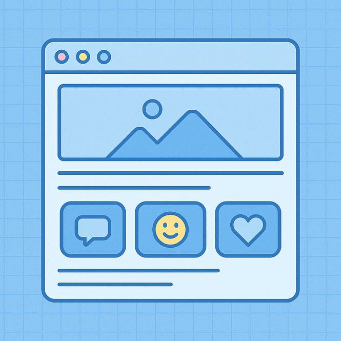
So, let’s get visual—mentally, that is! Imagine this: A product list shows “View Details” on every item. But then one version adds a magnifying glass 🔎 to the “View” button.
Suddenly, it pops! Or think about a “Chat Now” button. Adding a smiley face 😀 makes it way more clickable. Even a “Start Quiz” button with a lightning emoji 🗲 catches the eye.
Now ask: where are emojis doing the most work? The answer: in buttons that benefit from just a nudge of personality and clarity. This isn’t just about flair—it’s about user focus. Emojis draw attention in just milliseconds, helping users decide what action to take.
Found the Best Spots? Let’s Go Further!
You’ve explored the “where are emojis” mystery, and now you’ve got some solid answers. From navbars to call-to-actions, emojis help bring your buttons to life. But the real magic starts when you actually add them to your code.
Begin adding emojis now! Click over to our Pillar Post on How to Add Emojis to HTML Buttons! You’ll learn exactly how to add them, which ones render best across platforms, and how to test for accessibility.
Conclusion
In short: where are emojis best used in HTML buttons? Wherever they make things clearer, friendlier, or more fun. But always with purpose, not just pizzazz. Now go forth and sprinkle some emoji magic, but use it wisely! ✨.